Santa Cruz Archaeological Society
INDUSTRY: NONPROFIT / ARCHAEOLOGY / EDUCATION
SERVICES: WEBSITE REDESIGN, UX/UI, INFORMATION ARCHITECTURE, DIGITAL DESIGN
Role: Web / Visual Designer
YEAR: 2026
Clear · Accessible · Educational · Organized · Community-Focused
ABOUT THE PROJECT
The Santa Cruz Archaeological Society website redesign focuses on creating a clearer, more accessible digital experience for members, students, researchers, and the local community. The existing site contains decades of newsletters, historical information, events, archaeological projects, and educational resources, but much of the content is presented in long pages and dense lists. The refresh reorganizes this information into a more intuitive site structure while introducing a consistent visual system designed for readability, accessibility, and easier navigation.Project Goals - Simplify navigation - Reduce long, text-heavy pages - Improve access to archived content - Establish stronger visual hierarchy - Make the site easier to maintain in WordPress - Improve accessibility and readability

Key Challenges
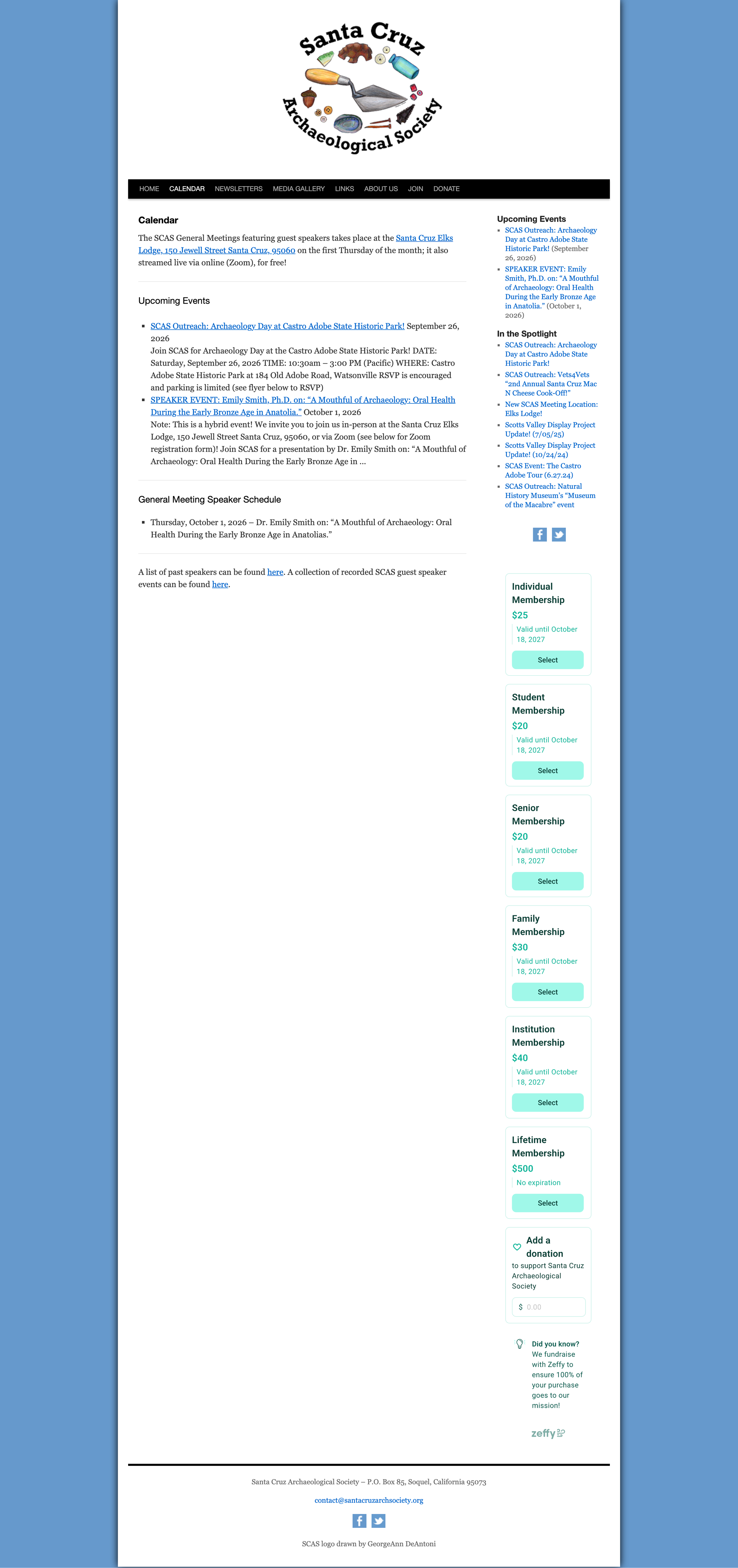
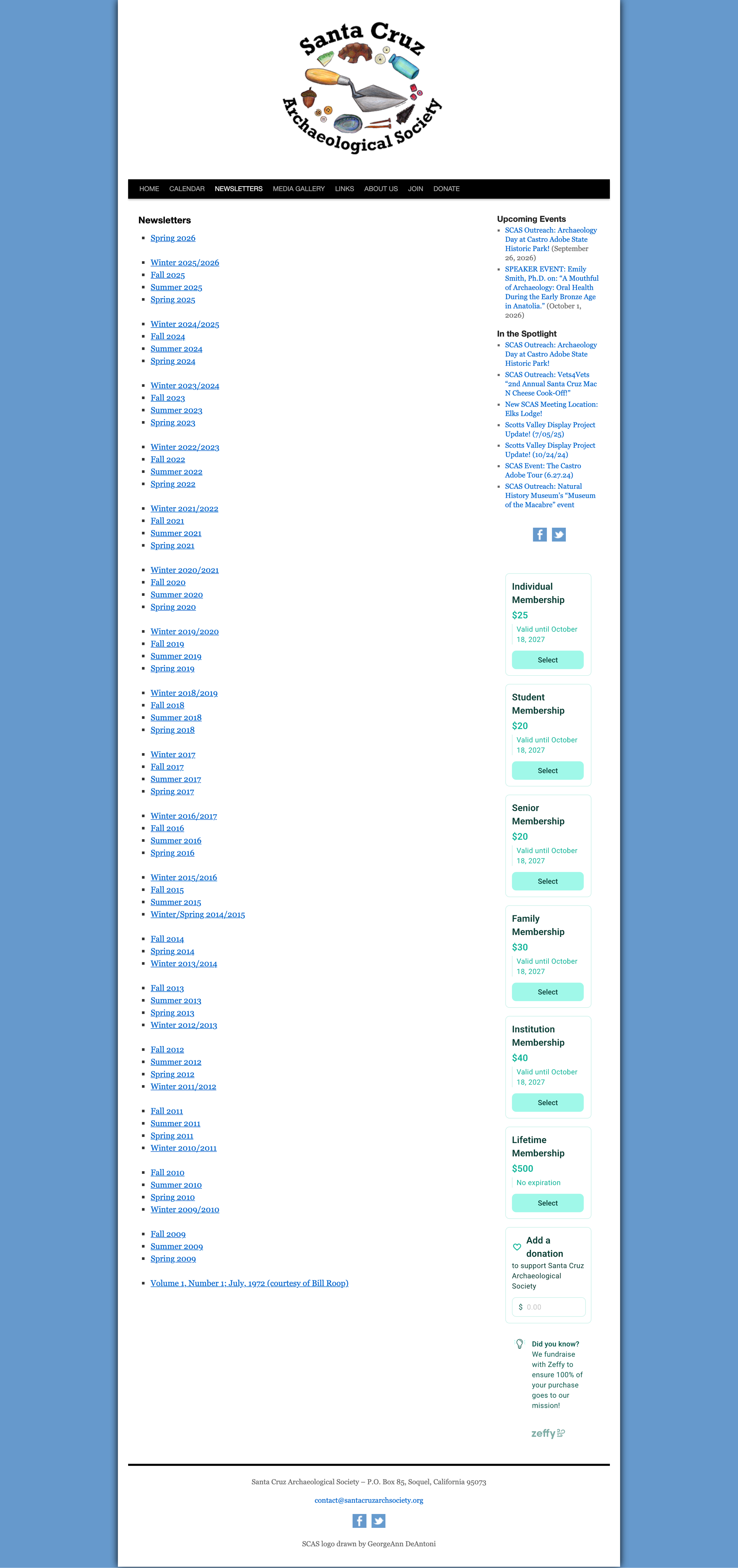
Long pages
Important information is often presented in long scrolling pages.
Content hierarchy
Current news, historical information, resources, and organizational content can have similar visual weight.
Navigation
Some content could be grouped more intuitively into categories and subpages.
Newsletter archive
Years of PDF newsletters create a long link-heavy archive that's difficult to browse.
Visual consistency
The site would benefit from a more unified typography, color, spacing, and component system.
HOME
CALENDAR
MEDIA GALLERY
NEWSLETTERS
ABOUT US
History
The Board
RESOURCES
JOIN
BEHIND THE DESIGN
Rather than placing large amounts of organizational information on individual pages, I reorganized the content into focused sections and subpages. This makes the site's navigation more predictable while reducing excessive scrolling.
BEHIND THE DESIGN
Creating a pet care brand that feels friendly, trustworthy, and approachable. The visual identity combines playful pet-inspired elements with warm colors and simple graphics to reflect the comfort and personal care provided during every stay. The goal was to create a brand that feels professional while still capturing the fun and loving personality of pet sitting.